Friday, September 27, 2013
LightPainting
Quick Greek linguistic lesson.
Photos~ Light
Graphie~ Writing or drawing
Photography is etymologically light painting. So here it is up close.
How do I blog again?
These are two images I submitted to a 'zine' a few friends of mine are creating focusing on youth. I don't know if either will be chosen but I submitted them nonetheless. The second I shot specifically for this project.
Tuesday, July 9, 2013
A Vs. B
This summer my good friend Bobby and I were finding ourselves a little bored. Both being in Ryerson's photography program we had been working on assignments all year long and found ourselves without much inspiration. So the idea came about to have a competition. It was to be friendly of course, and without winners, just two photographers taking a different word each week and making an image. Then we posted the image and saw what people thought. The themes so far have been: Cage, Nature, Break, B&W, Grief, and Canada. These three are Can't Cage the Beast, Stages of Grief, and Natural Beauty covering the themes of Cage, Grief, and natural, respectively. The easiest format for this is Tumblr (which I put aside my personal distaste for) and that is where our competition is hosted. It can be found by following the tab underneath the title of this blog called A Vs. B. We'll posting every week (ish) for the foreseeable future so feel free to check back.
Friday, May 17, 2013
How Much Does a Hipster Weigh?
The answer to that question is an instagram.
If you know me in person you know my dislike for this website. It's lazy, tacky, and annoying, legal issues aside. If you want to make your pictures look like cross-processed, or half-melted or expired film you should probably just use film like a lot of us do and screw it up (I haven't shot a roll of unexpired or "normal" film in a long time). Using a set of filters is pretty simply irritating. That being said, I don't mean to offend anyone, and I know from school this year that a lot of talented photographers to have instagram.
Anyway, rant aside, I have decided to explore the concept of square cropping as I feel that adds a certain feel to photos that can be used for purposes other then instagram.
So here are three of my insta-cropped photos.
And just for fun let's mock instagram again: Link (Language warning)
Archipelago
YouTube'ing
Now that I'm home for the summer I've got more time for creating. One of
my main projects I'm going to be working on this summer is maintaining a
semi-regular YouTube channel using the musical tendencies of my family
and friends. The first few have been me and my sister Maggie singing:
Wednesday, April 17, 2013
4 x 5 Series: Student
For my final 4x5 project I chose to undertake the concept of portraying challenging or isolating aspects of student life through quasi-still lives. The format I chose to employ is using a 1ft sketching mannequin, portrayed in real-life situations. The purpose of using a sketching mannequin as opposed to a life size mannequin or blow-up doll is to avoid the humorous aspect of the photos and to emphasize the size relation. The objects and places being so much larger than the subject are a metaphor for how challenging or isolating those situations can be for some. Half the photos were made in studio to monopolize on the lighting afforded by studio work, and to generalize the situations. The other half were on location for contextualizing reasons.
If I were to approach the project again I would want to do all of the work on location. I would also ideally approach this subject matter from a digital perspective because the analogue format wasn't really a part of the photos. Conceptually and technically it would have been nearly identical in digital, and much more manageable.
The reason I had for approaching a topic like this was because it is something that I've been dealing with the last year and I know many of my fellow classmates would agree. it is also a topic that isn't really discussed artistically because it can be seen to be too boring or everyday, but by incorporating the mannequin instead of a figure I believe I managed to bring this series out of that pitfall, and artistically address the issue in a way that (while flawed) talked to the problem and brought some light to the situation.
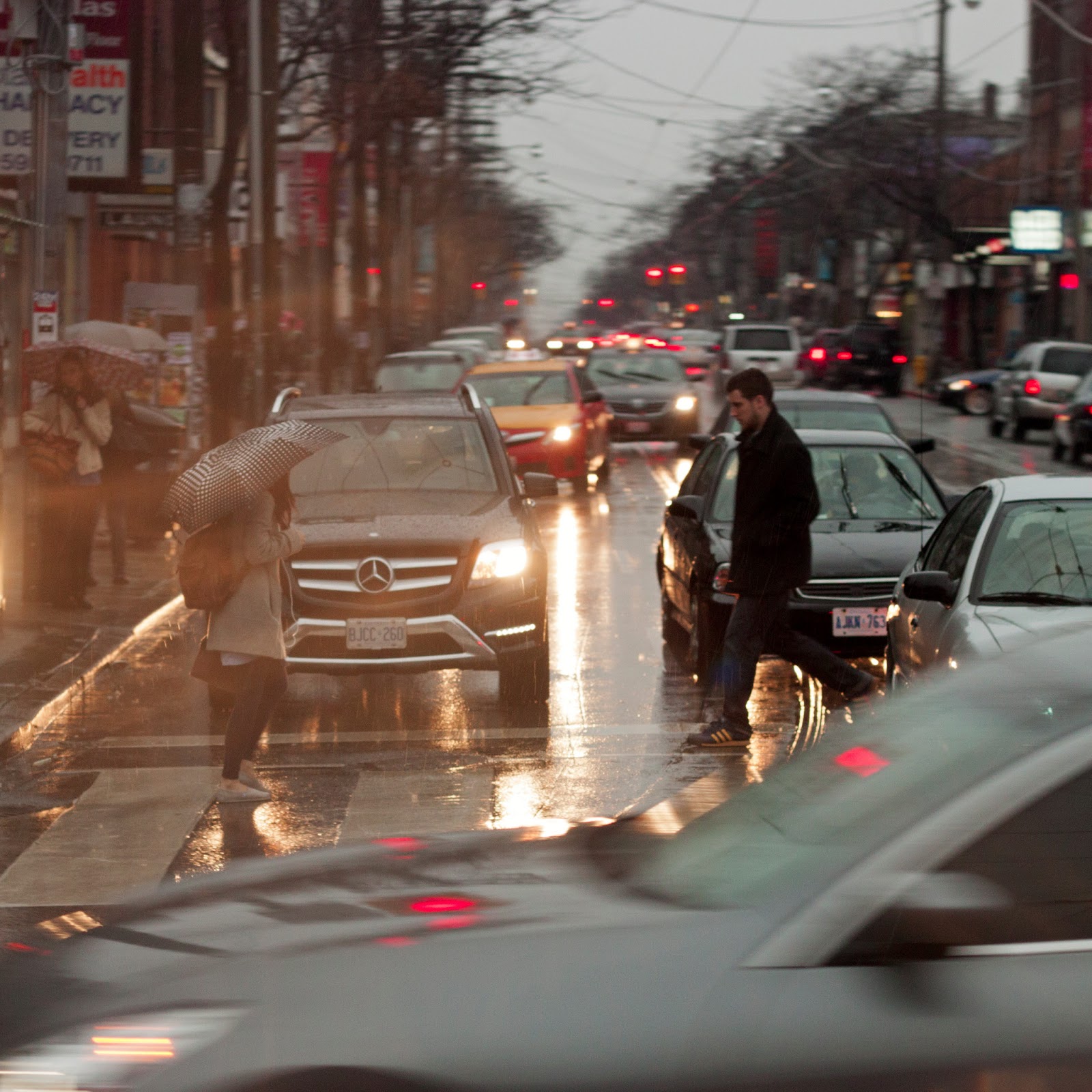
The photo in this series that I am the most proud of is definitely the Essay Writing photo, closely followed by the on location Walking photo. I feel the composition and technical aspects of these photos works better than the others. The photo I feel the least positive about is the photo with the envelope of change. I tried a few times to re-arrange the subject matter, but I still feel as if there is a better way of presenting it out there somewhere.
Archipelago
Subscribe to:
Comments (Atom)


